Overview
Barrel
Highlights from my design & strategy internship at New York’s leading E-Commerce design agency.
My Role
UX Strategy & Design, UX Audit, User Testing, Prototyping, QAs and Responsives, Design Systems, Leadership
Timeline
4 months
Project Type
Internship
Team
Junior Designer, Head Strategist , Design Manager, Account Manager, Engineer Lead
From Jan to Apr 2023, I interned at Barrel, a leading E-Commerce design agency in New York. I worked closely with their design and strategy team, supporting the design and development of multiple client projects: Well+Good, SmartyPants Vitamin, Lo&Sons, Tor.com. Here I will share my main project, where I led the user testing and prototyping for our client Rentacrate’s online purchase form.
I led a series of user testing and prototyping on the purchase form user flow for our client Rentacrate, a moving crate rental company.
Working with a team of strategist and designers, we generated insights and data that help our client validate their product decisions. We also identified potential usability issues and made relevant design recommendation that lead to a 36% boost in conversion rate. View the company case study.
Highlight project
Outcome
Stats at a glance
Live Design Video
6 weeks
project duration
5 rounds
of specifically designed user testing and iterative prototyping
36%
boost in conversion rate
Project Outline
Define
project objectives
testing goals
timing + constraints
define test structure
Design, Build & Launch
design tasks and questions
test launch & troubleshoot
Synthesis & Discovery
findings
insights on a target feature
Solutions
our design recommendations
final deliverables
Define
Project objective
Two purchase form structure
Two calendar picker style
Our Testing Goals
Timing + Constraints
Test Structure
Our client wanted to see if the new design of the purchase form would be effective in converting users. They want to evaluate whether to invest and move forward with the development of this new design.
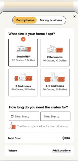
new design: a pop-up form with multiple pages, with a new style of calendar picker
new calendar picker design: a range pickersimilar to Google flight style
old design: a built-in scrollable form, with all information on one page
old calendar picker design: users need to choose individual dates for start and end date
01 Evaluate user’s preference between the 2 form structures and user flows
02 Evaluate user’s understanding of the new calendar picker
03 Identify any potential pain points in the new design
Ideally, A/B testings should be run in smaller batches focused on only 1 or 2 feature changes at most each time. But since we are given a tight timeline, we are designing a A/B navigation test that evaluate multiple feature changes. Our client also designated our testing platform to be Userlytics.
To fully understand the user experience of the new design, we opted for the think aloud tests with 10 users.
To identify user preference between the two designs, we chose an A/B navigation test.
We understand that the order of presentation can create selection bias. To avoid that, we did the tests in two batches: in the first batches, users are asked to navigate design A then B; in the second batch, B then A.
Design, Build & Launch
Design Questions & Tasks
Pre-test & Troubleshoot
We did a preliminary test internally with our colleagues to get a sense of the potential pain points. Based on those predictions, we designed user tasks and targeted questions to evaluate their understanding of the form.
We then streamlined the testing prototype based on constraints of the Userlytics platform.
Synthesis & Discovery
Findings
01
Users overwhelmingly preferred the new purchase form
02
Users have trouble understanding the base cost in relation to home size in both designs.
03
While the survey data shows that user prefer the new style of calendar design, through the recordings we discovered that only 20% understand the cost change in the calendar design.
Insights on calendar picker
We conducted think-aloud tests with 10 participants via Userlytics. I reviewed over 4 hours of interview recordings and summarized the following findings.
Here are some common user misconception on the new style of calendar picker:
The pricing reflects prime days vs "slow"days, i.e. supply and demand based.
Pricing under the dates reflected the penalty cost if you kept the crates longer than arranged.
Uncertainty regarding a base cost and whether this is a cost on top of that.
Solutions
Actionable Design Recommendation
Final Deliverables
As a result of these tests, we recommended our client to move ahead with the new design of purchase form, with the following adjustments:
01
Utilize a range style calendar picker to select their drop-off and pick-up dates.
02
Remove the pricing from the calendar due to the confusion it creates for the users.
03
Place a breakdown of the crate cost and the duration/rental period cost.
Final Live Design
With further input from our client, we subsequently developed 2 iterations that were rapidly tested for another 3 rounds of mini-testing, before the final design went into development. The design showed 36% increase in conversion rate in its test launch. View final design live here.
Team Training Documents
Since this was the first testing collaboration between design and strategy, I also created a notion doc as a user testing guide for the design team.
Finalized User Flow
here is the finalized user flow for the purchase form.
Reflection
Learning & Reflection
Through my time at Barrel, I had the opportunity to work with a cross-functional team and balance multiple projects with tight deadlines. I have gained important skills on time management, team collaboration and communication with stakeholders.
One of the biggest challenge I faced was building an effective, collaborative workflow for myself and my teammates when we run into unexpected or new situations. For me, the biggest lesson is allowing room for mistakes in early stage project planning.


